


💻 Other Pokéfolio Entries


👋🏻 Say Hi


UX Product Designer ·
connecting data and human experiences to create a user friendly experience.

UX Designer, UI Designer, UX Researcher, Project Manager
Web Application
AntAlmanac is a student planner application designed by students for students. It possess many great features like creating multiple schedules, shows students statistics on when students add classes, shows them where your classes are on a map, notifies students of availability in classes that were previously filled up, and many more.
To keep it short, redesign a button.
For more context, my team and I were brought onto the project to redesign a button so that they could increase the utilization rate of one of their features. The feature allowed students to add themselves to a list when a class was full so they could be notified when a space opened up for that class.
After the onboarding meeting, I thought the same thing as well. For a 10 week timeline it was not enough work for both my designers and myself. I took the initiative to explore the product to see if I could find other areas of improvement for my designers and I to work on.
Underutilized Features
Although there are many great features, from this web app, they are not being utilized. Either because of poor UI like the button or are unaware of the existing features.

Information Overload
The user is facing information overload because they have so many features presented to them at once. Rather than using many useful features to their advantage, many just plan their schedules and leave.

No Visual Hierarchy
The 2 previous issues stem from this main issue of having no visual hierarchy. Without the visual hierarchy, all features are at the forefront leaving the user overwhelmed and unlikely to use the other features.

Redesign the button the developers asked us to redesign to increase the utilization of their notifying feature
Create a visual hierarchy for the application to increase the utilization of unused features.
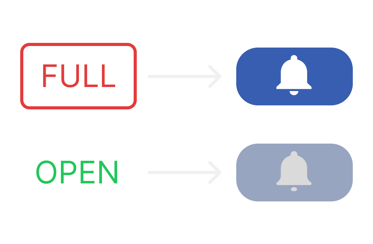
The original "button" was the word full with an outline of a rectangle. Visually did not look like a button nor did it signify that people could get notified. If the class was still open for enrollment, there would be no indicator at all.
In the new design, when a class is full the students can click on the button. If the class is still open the button will be greyed out, but if it's full then it will be blue to signify students they can click on it. The new design features a bell icon which is usually associated with alerts and notifications.

The old design had many buttons which crowded the design and had inconsistencies with the links like how past enrollment is a button but prerequisites is a link.
In the new design, we opted to simplify it by creating a description button which opened a modal that would tell the user the course description and any prerequisites that the class needed. Since the developers wanted to include other statistics besides past enrollment, we decided to make a statistics button which would open up a modal and allow students to decide what statistics they wanted to see.
Originally the indicator that showed whether a class was open or closed was doubling it's function as a button to get notified when the class was full.
However my team and I split it into 2 columns. One that showed the status of the class, the other to let them know whether they could be added on a list to be notified.


Many of the modals that were there, never gave enough information. For example classes that were selected appeared on the left but when you clicked on them the only function was to delete them from the schedule.
Due to the lack of functionality, we designed modals that would give more information and power to the user.

Pros: color is prominent and draw's user's attention
Cons: Not apparent that it's a button. Button doesn't give indication on its function or have a call to action (CTA)
Improvements: making it look more button like, have a design that either has a CTA or indicates a function.
Pros: Does provide important information for the user.
Cons: Clicking on the modal only deletes it from the schedule. No customization directly, must click on submenu to access customization.
Improvements: integrate more functionality into the modal like adding more customization options for easy access.


Pros: Allows easy access to all information.
Cons: No structure and may overwhelm the users with options. Links and buttons have inconsistent style.
Improvements: create a more cohesive style and establish some hierarchy by condensing some information

Pros: Simplicity
Cons: No picture integrated, must click on link to see image of building
Improvements: Adding a picture so that obscure buildings can be easily identified

How do students go about planning their schedules during the school year?
What do they like about Antalmanac and what are some areas of improvement?
What features do people prioritize over others?
Within the time span of a week my team and I collected 44 surveys
21 questions in total
5 contextual questions
9 questions about their experiences with planning schedules
7 questions about Antalmanac


I synthesized the data into a ranking list in order to make it easier to know what our redesign should prioritize and which features it should recess. This ranking was also meant to assist the developers on deciding which features to focus more resources on.
Ranking of what students consider first when looking at classes.
Ranking what notifications students will prioritize.
Ranking the most used features on AntAlmanac.
The button didn't look like a button and had no call to action or indication on what action it would perform.

My First Iteration:
Pros:
Cons:

Tammie's (one of my designers) First Iteration:
Pros:
Cons:
We made a hybrid solution by keeping the notify column separate from the classes' status and keeping the labels on top. We swapped out the toggles for the bell icons. With the columns being separated there was not need for the user to hover over the full button to reveal the bell icon.

Although the button was nice, our next problem was that the white background of the button had a poor contrast ratio with the light blue background that colored each row. Another problem was that when the user did finish adding themselves on the notify list, the check was too small to see.
We remedied it by making the button dark blue and make the button just a check mark in green so that the users can see it.

Bar with the course information was crowded and the buttons were inconsistent. It combined buttons and text links making the UI look inconsistent.

We condensed the past enrollment, prerequisites, and course description into one modal because they both have relevant information about the course. Developers also made it known to us that they would add other statistical data to the program in the future so we changed past enrollment to statistics in order to capture the other statistics as well.
Pros:
Cons:
We did usability testing and 70% of the participants had trouble locating where to find the statistics depending on whether we asked for course description first vs statistics first.
What we learned:

Taking what we learned from usability testing, we opted to separate the course info and statistics into 2 different buttons after. We kept the prerequisites and the course description together. This reduced the percentage of people that struggled from 70% to 40%
Class tiles on the schedule had very little functionality and provided minimal information. If the student wanted more information, they would have to look up the class in the search again.

We were able to design this first iteration and it was great because it had a lot more useful information and functionality.
Pros:
Cons:
We could have expanded the schedule size but it would mean that a student’s whole schedule wouldn’t fit on the screen.

We decided to have a smaller card that would expand to a larger card that would provide the same functionality and information, but in a smaller form factor.
The smaller card would only show the title and what class type the class was.
Map Modal was great. The only thing that needed to be added was a picture of the building. This would allow for the students to identify which building they needed to enter.
.png)
Using Maze.co my team and I conducted usability testing on 17 participants. 11 of those participants were able to make it through the entire test successfully. Alongside using Maze.co test, there was also a supplemental survey that would check to see if they were able to do the task as well. The questions would only be able to be answered if they were successful in the task.
Note: The usability test is one flow so that the users could follow the tasks in a certain order. If you want to see the full prototype, please return back to Final Design section to view full prototype.
View Usability PrototypeWe had 10 missions for the participants to complete. Each task was to check if the task became easier from our redesign.
Direct Success is described as the user following the intended path.
Indirect Success is described as the user following an unintended path but completing the mission.
Unsuccessful is described as they moved on to the next question without completing or completely left the test.
1️⃣
View Course Description
Users had to open up the course description to find out the prerequisites of the given class.
Number of Testers: 17
Direct Success
82.4%
Indirect Success
0%
Unsuccessful
17.6%
2️⃣
View Statistics
Users needed to open up the statistics menu to find out the class' statistic in the past enrollment.
Number of Testers: 14
Direct Success
80%
Indirect Success
6.7%
Unsuccessful
13.3%
3️⃣
Add Classes
Users had to successfully add a class to their new schedule.
Number of Testers: 12
Direct Success
91.7%
Indirect Success
100%
Unsuccessful
8.3%
4️⃣
Get Notified when a Class opens
Users needed to successfully add themselves to a list to get notified about their class reopening for enrollment.
Number of Testers: 17
Direct Success
45.5%
Indirect Success
54.5%
Unsuccessful
0%
5️⃣
Creating an Alternative Schedule
Users need to be able to successfully create a new schedule as an alternate.
Number of Testers: 17
Direct Success
90.9%
Indirect Success
100%
Unsuccessful
9.1%
6️⃣
Adding Classes to Alternative Schedule
Users needed to add different classes to this alternative schedule.
Number of Testers: 17
Direct Success
100%
Indirect Success
0%
Unsuccessful
0%
7️⃣
Adding a Discussion to the Original Schedule
Users needed to switch the discussion they had in their original schedule with the new one listed.
Number of Testers: 17
Direct Success
72.7%
Indirect Success
27.3%
Unsuccessful
100%
8️⃣
Add a Custom Event
Users needed to create a custom event and add it to their schedule.
Number of Testers: 17
Direct Success
100%
Indirect Success
0%
Unsuccessful
0%
9️⃣
Change the Color of the Alternative Discussion
Users needed to successfully modify the color of the tile on the schedule for a discussion.
Number of Testers: 17
Direct Success
90.9%
Indirect Success
9.1%
Unsuccessful
100%
🔟
Finding the Class
Users needed to successfully locate the map feature to find their class.
Number of Testers: 17
Direct Success
100%
Indirect Success
0%
Unsuccessful
0%
From the user testing conducted, we learned:
People were successfully getting notified from the notifications button on the top navigation bar.
People would be confused by the icons for course description and statistics and what their function is.
We updated the design so that the buttons would have labels so that user's wouldn't be confused. We also changed the icon from a bar graph to a line graph.
Plan on the Go!
Mobile would be the next step for the platform so that students could plan their schedules on the go. This would add flexibility and convenience for students
More Research!
In order to make the transition to mobile, it would be effective to collect more data to learn more about planning on mobile.
Adding More!
More features are always a plus however, since most of the core features are already there, it's most likely that future features will be in a submenu. However, A/B testing can be used to gauge the interest.
